 Virtual tours for remarkable stays
StayPano · Insights & guides
Where to place contact CTAs inside a 360 tour?
Where to place contact call-to-action buttons in a 360 tour: at the end of the viewing flow, at the most beautiful scene — one main CTA + one secondary.
Where to place contact CTAs inside a 360 tour?
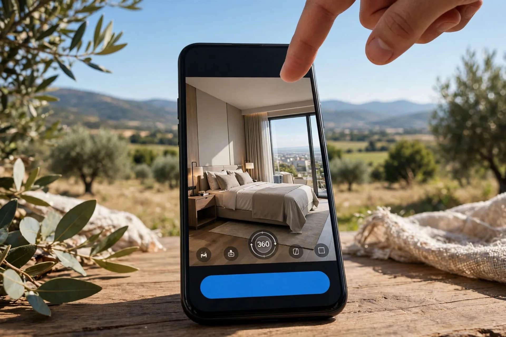
A beautiful 360 tour with no visible way to contact you loses half its value. Contact call-to-action (CTA) buttons bridge "viewing" to "booking" — but misplaced, they backfire: too early annoys, too hidden means nobody sees them. Where to put them and why.
The rule: CTAs after guests are "sold"
Guest psychology follows a sequence: curious → inspecting → convinced → wants to contact. CTA buttons belong at the "convinced" stage:
1. End of the viewing flow. After guests have walked the main scenes — they now have enough info to decide. Place "Book now" / "Get a quote" at the final scene.
2. At the most beautiful scene (the "closer"). Every tour has 1–2 "wow" scenes — the sea-view balcony, the glittering banquet hall. Place CTAs there: high emotion means easier action.
3. Inside price info points. Guests reading the price list are at peak contact intent — put the Zalo button right beside the prices instead of making them remember and hunt later.
Each tour: 1 main CTA + 1 secondary
- Main CTA: the action you want most — "Book a room", "Get a quote", "Schedule a visit". Big, clear, at the flow's end and the closer scene.
- Secondary CTA: lighter actions — "See more photos", "Back to homepage", "Share tour". For guests not ready to book.
Don't cram 4–5 CTA buttons across the tour — guests get confused and tap none. Fewer, well-placed beats many, scattered.
CTAs by venue type
- Homestays/hotels: "Book a room" → Zalo/fanpage link (see how to order a 360 tour for the intake flow).
- Restaurants: "Book a table" → phone/Zalo.
- Real estate: "Get the price list" / "Schedule a model-home visit".
- Spas/gyms: "Book now" / "Claim a free trial".
- Showrooms: "Chat for advice" → product pages.
Common mistakes
- No CTA at all: the most common mistake — a beautiful but "mute" tour; convinced guests with nothing to do next.
- Broken CTA links: test every button before handover — one wrong Zalo digit loses customers.
- CTAs blocking the view: oversized buttons center-screen ruin the viewing experience. Keep buttons compact, in corners or inside info points.
- Too wordy: "Click here to receive today's best booking discount offer" → shorten to "Book now".
For interaction types in general, see what are hotspots in a 360 tour.
Does your current tour have CTAs in the right spots? Send the tour link via Zalo — I'll review it and suggest button placement, free.
Read next: What are hotspots in a 360 tour? 5 types worth using · Measuring 360 tour results: which metrics matter?